Exercise 2: Street Photgraphy
1. Find a street that particularly interests you – it may be local or further afield. Shoot 30 colour images and 30 black and white images in a street photography style.
2. In your learning log, comment on the differences between the two formats.
3. What difference does colour make? Which set do you prefer and why?
Black and white v colour
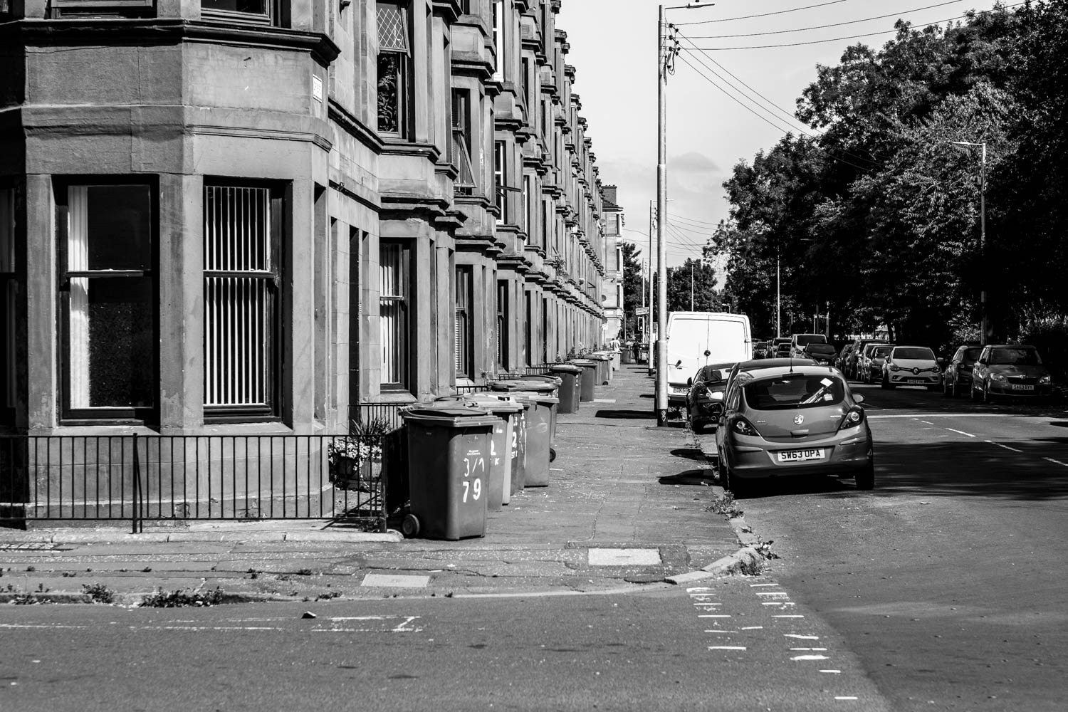
Shooting in black and white and then colour, forced me to think about the subject matter differently. The black and white photos helped accentuate the textures of the concrete and contrast in the shadows, helping lend atmosphere to the shots. In this case, the subject matter was a square block of flats and buildings that seemed to be at the beginning of a ‘gentrification’ process but still had many parts that have fallen into neglect, displaying signs of poverty and urban decay.
Black and white open up creative possibilities through lighting, shadows , how they can be juxtaposed within a composition for both a dramatic and focused effect. The use of contrast, shadow, grain, texture, form, and vignetting- all help create a feel and atmosphere, that in this case suits the subject matter perfectly.
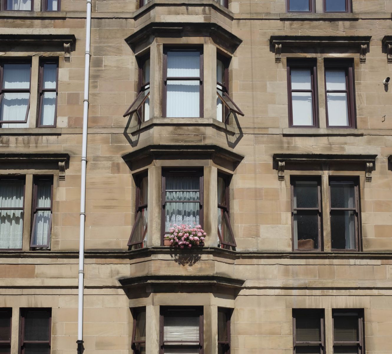
The colour set of photographs forced me to look for a different type of photograph. It’s almost as if black and white is more forgiving while colour tends to be more realistic. Put another way, and in the context of this set of photographs, black and white tends to communicate a feeling while the other a fact. Having said that, beautiful sunset in colour can communicate a feeling of calmness and serenity so when considering ‘either or’ the question has to be does it require colour? Which medium can convey the feeling you want?
I prefer the black and white set as it suits the subject matter. The images were also shot during a very sunny day and this combined with the urban subject matter helped lend an atmosphere that was suited to the gentrification and decay angle.
This exercise did make me think about colour more. Traditionally, street photography tends to be shot in black and white but when I looked at some of the work of Saul Leiter and Steve McCurry I began to see that colour can communicate the world as it truly is and the creative possibilities just as numerous. Obviously.
Looking at both sets of photographs some photos work better in colour and some in black and white. In the black and white set going from left to right, numbers 4,9,10,11,14,15 work well. The photo of the abandoned couch against the red wall translated well into black and white with the red coming out darker pulling the eye to the white couch. In the colour set, numbers 1,2,3,4,13,21 lend a more realistic view of what the street looked like. The first photo in the set is also in the black and white set (24) but works better in colour.


