

Exercise 2 Background as Context
Study Sander’s portraits in very close detail, making notes as you go.
Look at how his subjects are positioned in relation to each other or their environment. Are they facing the camera or looking away? What, if any, props does Sander use? Do these props seem relevant or are they strange? What physical stance does the subject adopt?
‘I hate nothing more than sugary photographs with tricks, poses and effects. So allow me to be honest and tell the truth about our age and its people’. — August Sander
August Sander was a German portrait and documentary photographer. Sander’s first book Face of our Time was published in 1929. Sander has been described as “the most important German portrait photographer of the early twentieth century”.Wikipedia
Sander set out to record and typogize people according to their professions and class, which he published in a book Antlitz der Zeit. He recorded each ‘type’ of person within seven categories, including farmers; skilled tradesmen; women; classes and professions; artists; city; and the last people (the homeless).

When looking at a selection Sander’s portraits, I am immediately struck at how a lot of the sitters look directly into the camera-this lends a sense of engagement, and while some appear relaxed, as the middle farmer in as_image1 , others, AS_image4 come across as self-conscious and uncomfortable.
Considering the scale of Sander’s ambition (and he seems to have had a system worked out for photographing his subjects), many hold the interest of the viewer and don’t come across as items in a cataloguing exercise. In some categories, e.g. skilled tradesmen, most are photographed in situ where they work or are holding signifiers (props) relevant to their profession-this lends context and makes it easier for the viewer to understand at a glance which category they belong to.-for example, images 3,5&6. Sander himself was a practitioner of ‘New Obectivity’-a movement which was a reaction against expressionism and focused on a practical engagement with the world, yet it is claimed,
‘Sander’s depiction of German people is unavoidably subjective. The volumes and portfolios he created are inseparable from Sander’s own politics, principles, and priorities.’ (https://www.moma.org/artists/5145 accessed 27/01/2022).
In Sanders’s images, we get minimal information, no names are used, and all are assigned to a specific type, yet many come across as individuals and hold the viewers interest. For example, in image7, the power of the image is amplified by the stance and pose of the brick carrier – his hand on his hip-lends an air of strength and defiance. This coupled with the lighting and framing, also give it a cinematic feel.
When photographing the categories of classes and professions, and artists, the style of the portrait seems to change from looking directly at the camera to being seated and lost in contemplation. Maybe this is an attempt to communicate their cerebral and class differentiation?. Props in this category tend to be backgrounds or chairs, and the placement of hands is not random but somewhat choreographed (image 10 and 15).
In the photo of the magnate, image 8, the gilded chair and wooden panelling (background) serves to remind us of class, wealth and status.
Even taking the period of history these images were made in, and Sanders’s own social influences, looking at his portraits and how they are categorised and neatly added to a type, one can’t help feeling that people would have been a bit more nuanced and fluid in their interactions and social movement. But this doesn’t take away from his ambitious work and his legacy. Despite his categorisation and assigning people to type, his images still shine a light on the individuals and leave the viewer wanting to know more about the people themselves-everything from the pose, angle, backgrounds and signifiers are considered and used to great effect amplifying the person within the category.
Make a portrait of someone you know, paying very close attention to what is happening in the background of the shot. Be very particular about how you pose the subject and what you choose to include in the photograph.
Ideally, the background should tell the viewer something about the subject being photographed. Reflect upon how successful this project was in your learning log or blog, discussing specifically what your intentions were in
terms of the background you chose in your image.
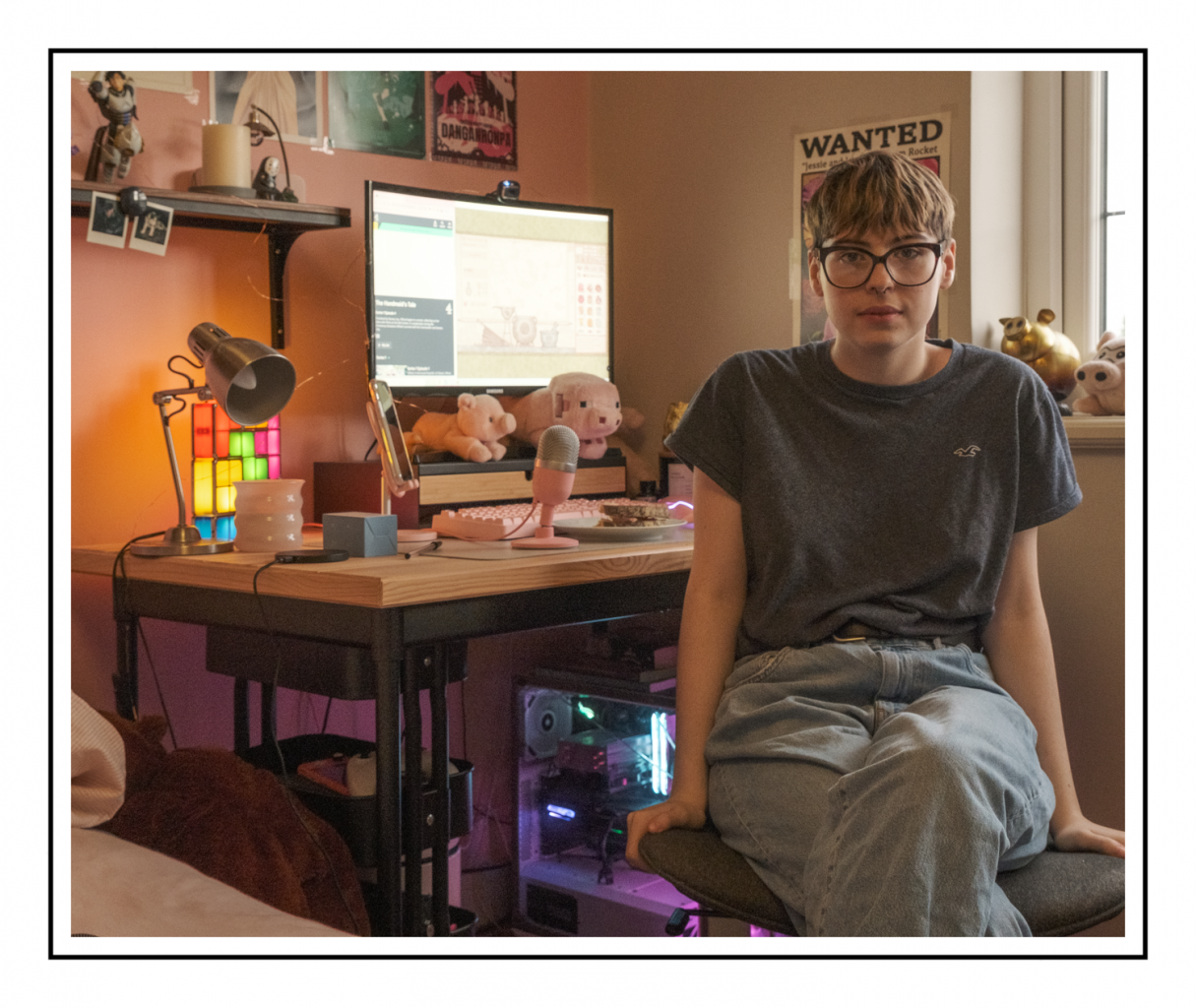
Moss spends a lot of time in this room, gaming, socialising and doing homework-its very much her domain, and she has it completely personalised to her taste and style.
In this portrait of Moss, I wanted to contextualise their life, interests and personality. I used the rule of thirds to guide the composition, using the window to provide natural light. I gave them some background into the assignment and wanted to have them as relaxed as possible to avoid any ‘camera face’ or cliched posing tropes seen on social media or in the poses of celebrities etc.
I took the image without giving too much direction and let Moss dictate her pose. This worked out well as they used their hands to balance on the chair giving the overall image a sense of balance. I used a 16-80mm zoom lens so I could control the overall composition and in this case, the elements in the background I wanted to include.
I learned a lot from this exercise, including setup and briefing for the sitter, composition, and in this case specifically, the balance between the sitter and background so one doesn’t dominate the other.
I wanted to present Moss and elements of their life to help the viewer form an opinion or picture (excuse the pun) of their life and I think I have managed to do this. Pink is their current colour, and they collect pigs,; they are into gaming -see bespoke PC-and into all things manga and Studio Ghibli.
In terms of composition, I wanted to get a balance between Moss and the background so one didn’t dominate the other. I tried to give the image a sense of visual hierarchy with Moss as the main focus, followed by her PC screen-her window to the world.
The image has set out what I wanted to achieve (more or less) but there are some elements that could have been done differently. I could have cropped it tighter and reduced the number of elements in view. The lighting from the PC lights the left-hand side of her face, and the light coming from the window, results in uneven lighting. Analysing the image post-shoot, I find myself considering every element and wondering just how much I want to do that in reality or take my chances and have the sitter totally relax and try to capture them in this state rather than a manufactured tableau.
References
August Sander (https://www.all-about-photo.com/photographers/photographer/393/august-sander 23/12/2022)August Sander German, 1876–1964 https://www.moma.org/artists/5145 accessed 26/12/2-22)
Five things to know: August Sander
Explore five top things to know about one of the most significant and influential photographers of the twentieth century (https://www.tate.org.uk/art/artists/august-sander-5319/five-things-know-august-sander accessed 24/12/2022)
Koetzle, Hans-Michael 2012,August Sander: “A Profile of the People” (2002) https://americansuburbx.com/2012/04/theory-august-sander-profile-of-people.html (accessed 24/12/2022)
The August Sander Project https://www.moma.org/calendar/programs/113 26/12/2022)
https://www.1854.photography/2019/01/sander-people-20th-century/