Assignment 4 WriteUp
Revisit one of the exercises on daylight, artificial light or controlled light from Part Four (Ex 4.1, Ex 4.2 or Ex 4.3) and develop it into a formal assignment submission. The submission requirement for this assignment is a set of between six and ten high-quality photographic prints.
There are many ways to edit and the most valuable one is probably to show your work to friends, family and your OCA peers for feedback – you are guaranteed to discover something new in your work. Another tip is to pin the work up on the wall and live with a for a few days. ‘A Quick Guide to Editing Your Photo Series using Stickies’ on the IPO (Invisible Photographer Asia) website, but bear in mind that this is not a narrative assignment – you’re not required to produce a story.
EDITING 101 – A Quick Guide to Editing Your Photo Series using Stickies
Assessment of photography in any context is an assessment of images and accompanying words so please Include a written analysis of your work outlining:
How you have developed the assignment from the original exercise in Part 4.
Which practitioners you’ve looked at for inspiration and how their work has influenced you.
Your technical approach and any particular techniques you incorporated.
The strengths and weaknesses of particular photographs and your project as a whole (self-assessment)
Conclude your notes with a personal reflection on how you’ve developed the exercise in order to meet the descriptors of the Creativity criteria. Write 500–1,000 words.
Background and Research
‘John Loengard, the picture editor at Life, always used to tell me, ”If you want something to look interesting, don’t light all of it.’ Joe McNally
‘Light makes photography. Embrace light. Admire it. Love it. But above all, know light. Know it for all you are worth, and you will know the key to photography’ George Eastmann
For assignment 4 I decided to develop the exercise on controlled lighting further. Building on what I had learned from exercise 4.3-using a combination of contrast, direction and colour to light an object- I decided to apply it to the subject matter from assignment 2-Twins-and experimented with the practice of chiaroscuro using controlled lighting to add light and shadow, emotion, dimensionality and depth to my compositions. I wanted to create pictures rather than take them and tried to envision the outcome before shooting, planning the lighting setup, but also left room to experiment to get desired outcomes.
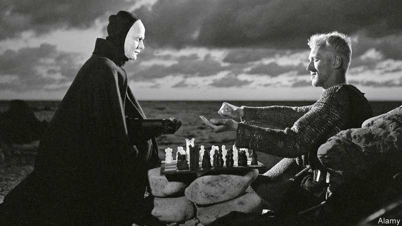
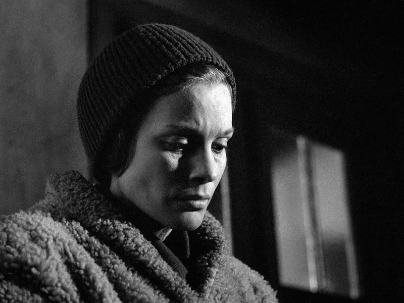
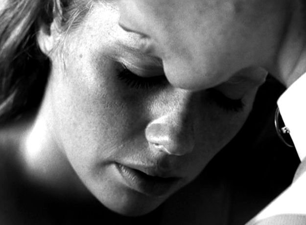
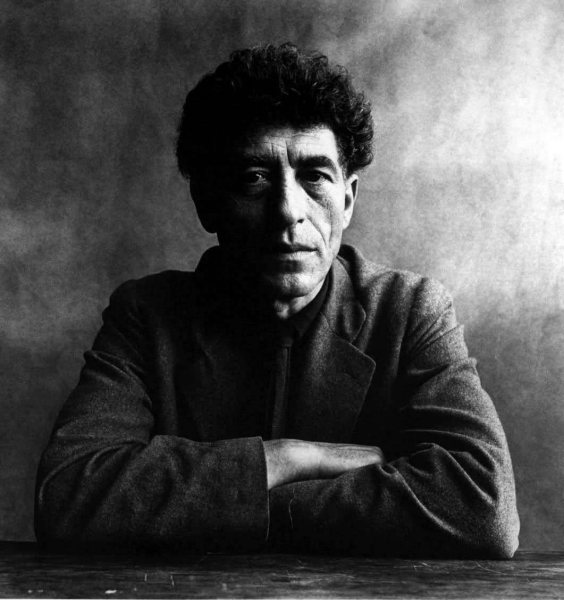
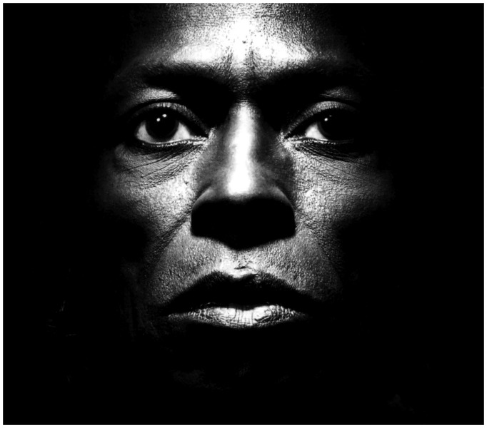
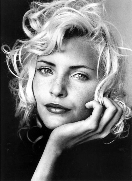
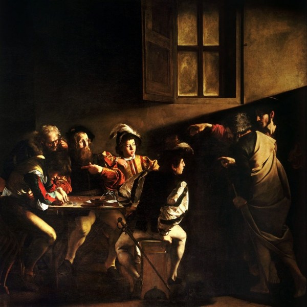
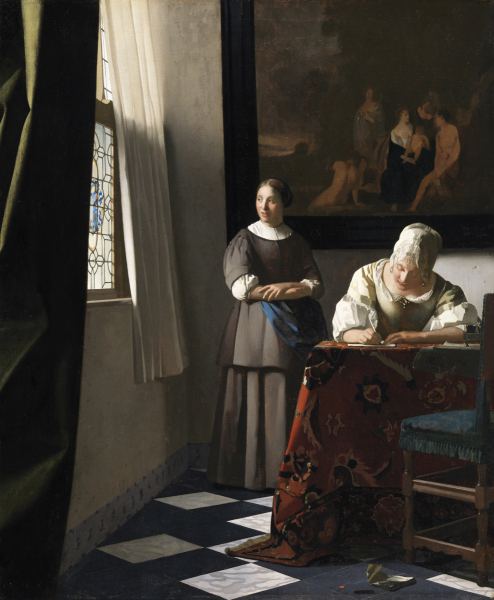
As part of my research, I looked at artists from cinema, photography, and the art world including Ingmar Bergman, Angus McBean,Irving Penn, Carvaggio, Varmeer and Da Vinci.
Ingmar Bergman
Ingmar Bergman was a Swedish film (and stage) director and producer whose use of light (and screenwriting and direction) led him to be considered among the most influential filmmakers of all time. He appreciated and used light as an integral part of his movies, often in collaboration with cinematographer Sven Nykvist, and in later life gave some insight into his attitude towards light, “Sometimes I probably do mourn the fact that I no longer make films. This is natural and it passes. Most of all I miss working with Sven Nykvist, perhaps because we are both utterly captivated by the problems of light, the gentle, dangerous, dreamlike, living, dead, clear, misty, hot, violent, bare, sudden, dark, spring-like, falling, straight, slanting, sensual, subdued, limited, poisonous, calming, pale light. Light.”
Bergman used light to highlight the natural and existential world of the characters on screen. His use of shadow, contrast, and lingering focus on faces helped capture both the external and internal forces at play in a character’s condition. Stills from his movies are both instructive and a source of inspiration in how light adds an emotive dimension to a photograph.
Angus McBean
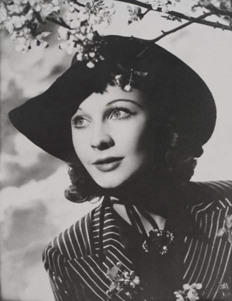
Angus McBean (1904 -1990) was a Welsh photographer renowned for his celebrity portraits of British theatre greats -Olivier, Novello, Vivial Leigh, Audrey Hepburn, Quintin Crisp, Peggy Ashcroft-the list is long- as well as surrealist compositions and montages. What struck me about his work was the use of light in his portraits. Bean paid as much attention to his development of negatives and print, and as Adrian Woodhouse (1982:14) observed, ‘he controlled the manufacture of brilliant textures and tones of his prints, with their velvety blacks, infinite varieties of depth and smoothness of half-tone and sheer painterliness of chiaroscuro, they have no equal in British photography’ It was this depth that I tried to achieve in my images.
Irving Penn
Irving Penn (June 16, 1917 – October 7, 2009)[1] was an American photographer known for his fashion photography, portraits, and still lifes and is considered to be one of the most important and influential photographers of the 20th Centuries. It was his portrait photography that I looked to for inspiration and his use of light and attitude towards light, as he explained ‘ “I share with many people the feeling that there is a sweetness and constancy to light that falls into a studio from the north sky that sets it beyond any other illumination,” he once reflected. “It is a light of such penetrating clarity that even a simple object lying by chance in such a light takes on an inner glow, almost a voluptuousness.” (artnet.org accessed 10/07/2021)
Chiaroscuro
Chiaroscuro is an Italian term that translates as light-dark. It has a long history and was ‘one of four modes of painting colours available to Italian High Renaissance painters, along with cangiante, sfumato, and unione -all are techniques to create the effect of shadow, highlights, tones, graduation etc.
According to theartstory.org
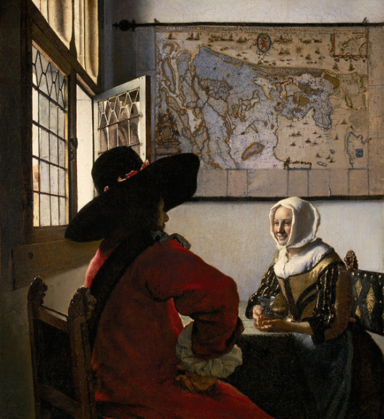
‘In paintings or drawings it refers to the balance and pattern of light, artists who are famed for the use of these techniques and illuminating visual narratives out from the shadows, include Leonardo da Vinci, Vermeer and Caravaggio (among many others). According to theartstory.org ‘Chiaroscuro, tenebrism, and sfumato were used by artists for different purposes: to create an air of mystery, private intimacy, psychological complexity, to evoke nightmarish realities, to produce haunting dramatic encounters, or to suggest the metaphorical battle of light and darkness playing out in a variety of contexts’.
In practice, chiaroscuro is today somewhat ubiquitous and taken for granted, but looking at selected works of the artists mentioned above, I was able to deepen my knowledge (and take inspiration) of how to use light within compositions and create atmosphere and depth- with intent.
Preparation and equipment
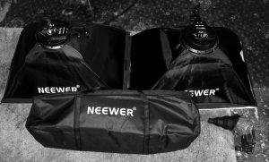
I used two softboxes, a rig to hold the background, and an off-camera flash with a snoot to help direct line and control the beam from the flash.
Having researched lighting setups and taking inspiration from the sources mentioned above I began to plan my shoot. I wanted to experiment as well as gaining experience and proficiency at using lighting to achieve different lighting effects. I used and an assortment of lights including, 2 dimmable softboxes, off-camera flash and a snoot to control the direction and radius of the light beam, as well as black and white backgrounds on a rectangular stand. I had specific shots I wanted to take and these formed the basis of the series including, lighting from left and right with one softbox, sometimes in combination with the off-camera flash/snoot which I was able to move around and fire at different angles-below, above etc.
In total, I shot 3 sessions spending time evaluating my photographs, learning from one session to another, understanding how artificial light works- and especially when it’s converted to black and white. My camera equipment included a fixed and fast 56mm F 1.2 lens mounted on a Fujifilm XT-3 camera and tripod.
Techniques I used included:
- Chiaroscuro
- Low key
- Single light
- Double lights
- Off-camera flash with a snoot attachment
Post Production
I converted the photographs to black and white using Adobe Lightroom and Silver Efx Pro 2.0-I pushed the contrast and tweaked shadows and highlights but not to extremes preferring the lighting to achieve the look I wanted rather than relying too much on editing and processing.
Printing
I hand-printed all images on a Canon Pixma 100s using Marrutt 280gsm Traditional Baryta Hi-White Semi Gloss Inkjet Photo Paper, and used Adobe Photoshop to sharpen the images before printing using a high-pass filter technique.
Reflection
Creating photographs with controlled light, opened up a world of creative possibilities. I experimented with lighting from different angles and types, and as I began to feel confident I realised that you don’t just see the light (artificial or natural) you can also feel it. There is an emotional resonance that can turn a mundane photograph into something much more dimensional, emotional and interesting. The transitions from shadow to light and space in-between, the tones from black to greys and white, open up endless possibilities.
I couldn’t help thinking of Michael Schmidt’s “Thoughts About My Way of Working” (posted 2010 https://americansuburbx.com) where he comments,
‘I prefer black and white photography because it guarantees the viewer a maximum amount of neutrality within the limits of the medium. It reduces and neutralizes the coloured world to a finely nuanced range of greys, thus precluding an individual way of seeing (personal colour tastes) by the viewer. This means that the viewer is able to form an objective opinion about the image from a neutral standpoint independent of his subjective colour perception. He is thus not emotionally distracted. In order to achieve a maximum of objectivity and thus create a photograph which possesses credibility and authenticity as a document (factual information), I prefer to work with neutral diffused light, i.e. to produce an image without noticeable shadows.’.
While I agree to a point with Schmidt regarding photography’s neutrality and authenticity as a document, I also feel that the creative possibilities afforded by artificial (or natural) light, the camera, lens, and exposure (ISO, aperture, duration) are limitless and as valid as using a camera to produce authentic and neutral images devoid of emotion.
I learned a lot through trial and error and managed to create a series of photographs that work. As a parent of the subjects, I carry a lot of history and connection to them and agree partly with Victor Burgin that it’s not possible to have an innocent look at any subject-as he says,
‘There can never be any question of ‘just looking’: vision is structured in such a way that the look will always-already entrain a history of the subject.’ (Burgin, 1982, p.188)
but photography offers us so many (creative) possibilities that the point is somewhat moot. For me, one of the critical things that photography offers is the ability to capture a sliver of time that works on so many levels-it captures a scene for posterity and the power/resonance of that scene also changes with time, for the viewer, for the subject, and for the photographer. Perhaps Moss and Grace will look at these photos in years to come and ponder life during the great lockdown, I’ll definitely see these photos differently, use them as a reference point to a place in time, in their history. Someone else might see them in twenty years as teenagers during the Covid pandemic (or whatever), the combinations are endless, and this is what makes photography so interesting. Frederick Douglass expressed it well when he said
‘Pictures, like songs, should be left to make their own way in the world. All they can reasonably ask of us is that we place them on a wall, in the best light, and for the rest allow them to speak for themselves’. (Barbash, Rogers, Willis 2021:17)
The photographs
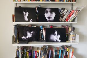
Curation helped me look at the photographs from different perspectives and with time, I began to see them differently.
The series of photographs, of twins, is mostly about them as individuals rather than being part of a single ‘Twin’ identity that people often categorise or use as a term of reference. I attempted to use the different combinations of light setup to:
- Create a sense of atmosphere and give them dimensionality
- Highlight aspects of their mood
- Highlight and focus on aspects of their face
- Experiment with the elements of light-contrast, direction,shadows, difussion etc.
I printed selected photographs and ‘lived’ with them for a period of time to help me curate and find a selection that worked as a series. I studied them from different perspectives -some worked as a single photograph while others worked better in the series. Print also helped me curate and I cropped some during the printing process.
Seeing all photographs together helped me swap out some for others that worked from an angle or composition perspective. I also asked some people to look at them and noted their reactions-for example photograph 1 and 7 resonated with the majority of people who viewed them.
All the photographs can be seen here
Further Development
This is the second time I have used twins as subject matter and in some respects, I feel I played it ‘safe’ for this series and could envisage developing it further by experimenting with the amount of grain used and maybe tighter cropping to really focus on certain aspects of their face. Printing the photographs introduced a haptic artefact into the mix and I would like to explore this further, using different types of paper and size of the prints.
Reflection after mentor feedback
In the feedback for assignment 4, my mentor suggested ‘add some text re: thinking process/relationship between lighting and the narrative/mood of your sitter explain some of my intent for each photo.
Some photos are about the technical aspects and light positioning, while others are a combination of both lighting and the personality traits of the subjects.
Photo one: I wanted to light a part of the subject’s face and fade the rest into darkness. My motivation was both a technical one (position of lights etc) and also a comment on revealing part of what’s really going on. The subject is my daughter and as with all teenagers, you always know what going on in their heads.
Photo 2 &3: 2-This was also about the positioning of the lights one each side, slightly darker in the middle. Was trying to accentuate her face-kinda worked.
Photo 4. This is all about the angle and adding a little bit of tension.
Photo 5. Pensive. Used a snoot to create shadows from her hair across her face.
Photo 7. The subjects are twins. I tried to blend the
Phoyo 8. This is about depth and the use of light and shadows to acheive that.This and first phtoto work best for me.
Final thoughts:There was alot going on when I did this series-I mostly wanted to extend my use of lighting skills and extend my workflow into producing high qualkity prints. I acheived both to a decnet level but maybe sacrificed the red thread through the series-I could have for example expanded the capturing a piece of the face concept and worked with that more or really dig into the realtionship between the subjects (Twins) and brought that out more.
References
Barbash, Ilisa, Rogers, Molly,Willis, Deborah (2021) To Make their Own Way in the World, Pea Body Museum
Bull,Steven (2010),Photography,London,Routlaage-Taylor and Francis Group
Kodak, (1985) The Magic of black-and-white, S.A. Mitchell Beazley Publishers
PressHince,Peter, 2011,The Portrait Lighting Reference, London:The Ilex Press Limited
Renee, V, 2018, Chiaroscuro Lighting: How to Create the Stunning Look In Your Images https://nofilmschool.com/2015/11/lighting-like-vermeer-create-cinematic-depth-lighting (accessed 22/12/2020)
https://americansuburbx.com/2010/10/michael-schmidt-thoughts-about-my-way-of-working-1979.html (accessed Dec 5th 2020)
The National Gallery https://www.nationalgallery.org.uk/ (accessed 26/12/2020)
https://www.theartstory.org/definition/chiaroscuro-tenebrism-sfumato/ (accessed 1/01/2021)
https://photographyandvision.com/2016/06/06/mondays-inspiration-irving-penn/ (Accessed Jan 15th 2021)
https://en.wikipedia.org/wiki/Irving_Penn (Accessed Jan 15th 2021)
Welch, Adam, 2020, Decoding Chiaroscuro: How To Shoot Glorious Clair Obscur Photos https://contrastly.com/decoding-chiaroscuro/ (Accessed Dec 20)


