

Exercise 1: Looking at Advertisements’
OCA tutor Dawn Woolley wrote a regular blog on the weareoca website called ‘Looking at Adverts’. Read one of Dawn’s articles and write a blog post or make a comment on the site in response.
 What I took away from the article ‘Looking at Adverts 1’ is that advertising images rely heavily, in most cases, on the text to anchor meaning and have maximum impact. However, other factors like culture and social orientation also impact how we read or receive an image.
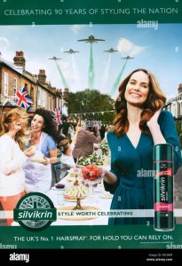
In this image, without the product branding, I had no clue what it was about. At first glance, I thought it was about strawberries! Looking at it in terms of semiotics, i.e. denotation-literal or universal/objective meaning and connotation-which is more subjective, emotional, and cultural associations, I began to deconstruct it. I’m not British though I have lived here a long time, so the ‘Britishness’ troupes of street parties and flyovers communicated to me some form of royal event. I was surprised to find it was for hairspray, and it comes across as rather old-fashioned and traditional-and maybe this was the intent.
Reading the comments to the article and the image brought home to me how different elements of an image can mean different things to people. So, it needs text to really lock down and communicate its meaning. My key takeaways included:
-
- In the majority of cases, advertising images need text to anchor their meaning
- Connotation is an important consideration to either reinforce a message or reduce ambiguity
- Effective advertising can use 3 types of text:
- Directional-explains the image to the viewer
- Orientation- doesn’t explain but orientates and allows the image to do the rest of the work.
- Complementary- creates meaning and connection. By adding text a space between the image and copy creates and encouraging meaning.